Contact Us
Questions, custom work or a demo? Get in touch and our team will get back to you.
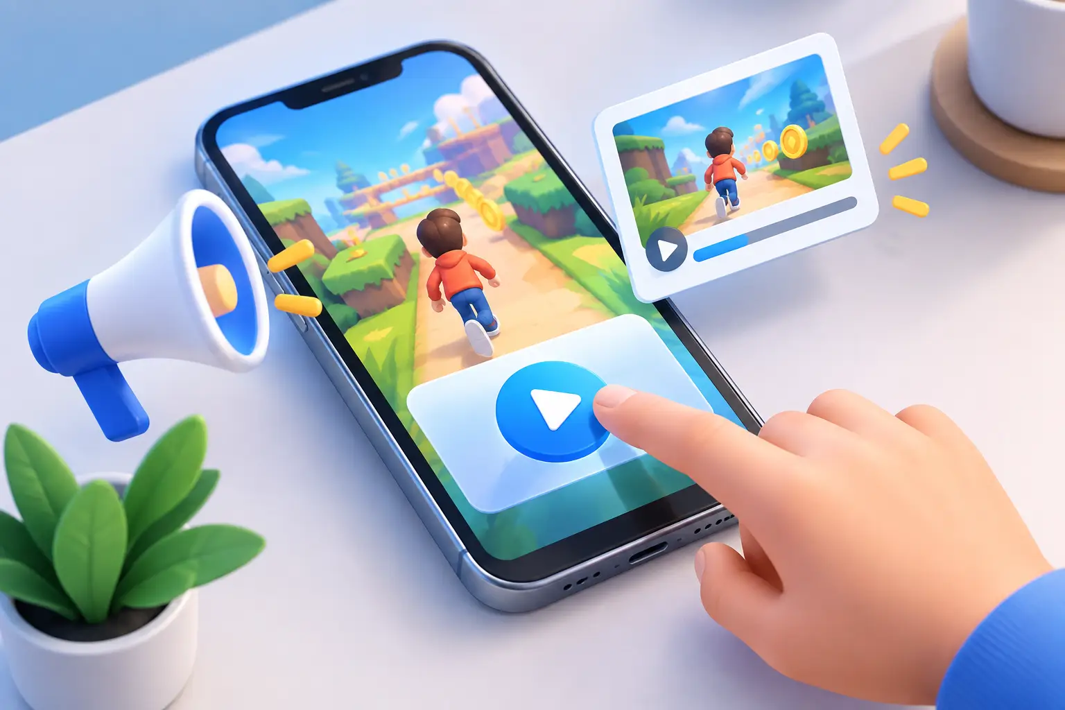
A playable has a few seconds to answer the only question that matters to a potential player: “Would I enjoy doing this?” Knowing how to create playable ads is less about rebuilding your entire game in HTML5 and more about choosing one satisfying action, making it instantly understandable, and giving the user a reason to finish.
The strongest playable ads do not try to explain every system in the game. They create a short, tactile promise. Merge two units. Draw a path around an obstacle. Pull the right pin. Time a jump. Then connect that moment to a clear install screen.
Start with the game loop, not the campaign brief. Ask what a new player does in the first minute that feels distinct, visually readable, and satisfying on a phone screen. That action is your playable’s foundation.
For a match game, the core interaction may be swapping two pieces to trigger a large cascade. For a runner, it could be swiping between lanes to collect a high-value item while avoiding one obstacle. For a strategy title, it may be dragging a squad into the correct position before a short battle resolves. Keep the selected moment narrow. A playable ad is a product demonstration and a creative test, not a tutorial for every feature.
A useful structure is simple: show the problem, prompt one action, reward the action, then present the install call to action. The first visual frame should establish what the user is looking at without a wall of instructions. If the interaction needs an explanation longer than one short line, simplify the mechanic or improve the visual cues.
Many teams make the mistake of opening with a passive logo animation or a slow story setup. That costs the most valuable seconds in the ad. Show gameplay immediately. Branding can appear in the game UI, at the end card, or in a brief transition after the player has already engaged.
A mechanic that is fun in the full game can be weak in an ad. Playables have limited space, short attention spans, and no time for complex onboarding. Prioritize actions that work with a tap, drag, swipe, or simple timed choice.
The best candidates are usually readable at a glance. The player should recognize an enemy, a reward, a blocked path, or an incomplete object before they touch the screen. Avoid tiny UI targets, dense menus, long dialogue, and interactions that rely on precise control. A user should be able to understand the goal even if they start tapping early.
There is also a truth-in-advertising trade-off. A deliberately exaggerated puzzle may attract clicks, but it can create a poor handoff if the installed game feels unrelated. You can simplify the game loop for the format without inventing a different game. Preserve the art direction, the central fantasy, and at least one mechanic the product actually delivers.
Before production, write the experience as a five-beat script. For example: a character faces three enemies, an arrow points to a power-up, the user drags the character to collect it, the character wins a quick encounter, and the end card shows the game with an “Install” prompt.
This script forces decisions that otherwise get buried in feedback rounds. What does the player do? What happens if they do nothing? What counts as success? What happens after a miss? Where does the CTA appear?
A good default is to let the user act within the first second or two. Use motion, a finger icon, an arrow, or a subtle pulse to guide attention. Then remove the hint as soon as the interaction begins. The goal is to make the player feel like they made the decision, not like they watched an automated demo.
Design the fail state carefully. A hard failure can be useful when the fantasy is “try again and beat this,” but it should not trap the user in a dead end. In many mobile UA playables, a soft fail works better: the player makes an imperfect move, the game shows a near miss, and the CTA still appears. You retain the dramatic tension without wasting the impression.
Interaction without feedback feels broken. Every tap, drag, or swipe needs a visible response: objects move, a meter fills, coins burst, an enemy reacts, or a board changes state. Add sound only when it reinforces the action, not as a substitute for clear visual feedback. Many users will see the ad with audio off.
The payoff should arrive quickly. If the reward requires ten seconds of passive animation after one tap, the playable loses its momentum. Keep the transition from action to outcome short, then use the end card to reinforce what happened. “Build your squad,” “Solve the next puzzle,” or “Collect more rewards” is more meaningful when it follows a demonstrated action.
Playable production gets expensive when every new concept becomes a custom engineering project. Separate reusable pieces from concept-specific pieces early. Buttons, end cards, background layers, reward effects, tutorial hands, UI panels, and common scene transitions can often carry across multiple concepts.
For each test, change the thing you actually want to learn. If you are testing whether a merge mechanic or a combat mechanic attracts better players, keep the end card and broad visual treatment consistent where possible. If you are testing a new visual hook, do not also change the core interaction, difficulty, and CTA. Otherwise, the result is harder to interpret.
Video can be a useful starting point. A high-performing gameplay video may reveal the framing, pacing, and visual moment worth turning into an interactive sequence. But do not simply place a tap layer over a video and call it playable. Add a meaningful decision and a response that makes the user feel involved. The interactive beat is the reason to use the format.
No-code production tools are especially useful for this stage because creative teams can build variations without waiting for engineering changes. In PlayableMaker, teams can start from a template, adapt reusable assets, convert video-led concepts into playable flows, and make scene or interaction changes in a browser-based builder. Advanced teams can still control game logic and assets when a concept needs more than a standard template.
A playable can look correct in a desktop preview and fail on a real device. Test it on multiple mobile screen sizes and interact with it as a distracted user would. Tap too early. Tap repeatedly. Leave it idle. Drag outside the intended area. Rotate only if the format supports it. These behaviors reveal unclear touch targets, stuck states, and timing problems quickly.
Technical checks belong in the production workflow, not at the end of a launch deadline. Advertising networks can differ in accepted file formats, packaging rules, size limits, orientation, click behavior, and MRAID expectations. Confirm the current requirements for the specific network and placement before final export. A playable that is visually strong but rejected in review cannot teach you anything about creative performance.
Validate that the CTA is always reachable and that the ad does not depend on external assets loading at the moment of interaction. Compress images sensibly, remove unused files, and avoid overly heavy animation where a simpler effect communicates the same idea. File size is a creative constraint, not just a technical one. It forces focus.
Once a playable is live, resist the urge to rebuild it immediately. First, identify where the experience may be losing people. Is the opening frame unclear? Is the tutorial prompt ignored? Does the reward arrive too late? Is the end card disconnected from the playable action?
Create focused variants. Test a different first-frame problem, a faster prompt, an easier first move, a more dramatic reward, or a different end-card message. Keep a record of the hypothesis behind every version. “Version B has a clearer drag target” is actionable. “Version B feels better” is not.
The production advantage comes from treating playable ads as a repeatable creative system. Build a small library of proven interactions, components, and technical checks. Then give each new campaign a specific job: validate a mechanic, a fantasy, a visual hook, or a player motivation. The fastest teams are not the ones that make the most complicated playables. They are the ones that can turn a strong idea into a testable, network-ready experience before the insight goes stale.