
TL;DR:
- UI plays a crucial role in ad performance by influencing load speed, user navigation, and trust signals. Faster, simpler, and clearer interfaces significantly increase conversions and reduce bounce rates, especially on mobile devices. Preparing diverse, authentic UI assets for AI-driven platforms enhances relevance, while consistency across user flow amplifies overall results.
Most marketers pour their energy into crafting the perfect headline or visual concept, yet the role of UI in ads quietly determines whether that effort ever pays off. A user may encounter your ad with genuine interest, but a slow load, a cluttered layout, or a confusing form will end the interaction before the message lands. Research confirms that UI as a core strategy drives revenue growth, not just cosmetic appeal. This guide breaks down exactly how interface design decisions shape ad performance, with data from 2026 and practical steps you can apply today.
Table of Contents
- Key takeaways
- The role of UI in ads: why performance comes first
- Structural UI design and form completion rates
- Visual clarity and messaging in ad UI
- The evolving role of UI in AI-driven advertising
- Practical application: integrating UI into your ad strategy
- My perspective on UI and ad performance
- How Playablemaker helps you apply UI principles
- FAQ
Key takeaways
| Point | Details |
|---|---|
| Speed is a conversion lever | A one-second load delay reduces conversions by up to 20%, making performance a design priority. |
| Simpler forms complete more often | Reducing form fields from seven to three can increase completions by 30 to 50 per cent. |
| Visual clarity beats polish | One dominant message with a clear call to action outperforms visually complex, highly produced ads. |
| AI needs diverse assets | Supplying varied, high-quality UI assets gives AI platforms the inputs needed to serve relevant ad experiences. |
| Test and iterate systematically | Auditing load speed, visual hierarchy, and form structure in sequence produces measurable, compounding improvements. |
The role of UI in ads: why performance comes first
The most direct way UI design impact on ads shows up is through speed. Before a user reads your headline, judges your offer, or taps your call to action, the interface has already made an impression. And that impression is largely technical.
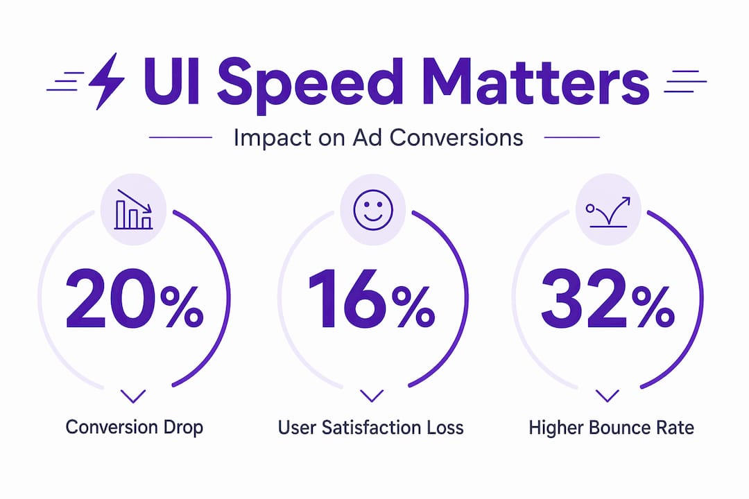
A one-second load delay reduces conversions by 20% and user satisfaction by 16%. Bounce rates rise by 32% when load time increases from one second to three. These are not marginal differences. They represent the difference between a campaign that breaks even and one that compounds returns over time.
The financial weight is significant too. Slow load times cost retail businesses $2.6 billion annually. That figure reflects not just abandoned checkouts but lost trust and reduced lifetime value from users who do not return.
The mobile context makes this even more pressing. Every 0.1-second reduction in mobile load time can increase completed transactions by 12%. Achieving that often means stripping unnecessary visual assets, compressing images, and reconsidering autoplay video in ad formats. Performance is not separate from design. It is a primary design element.
Pro Tip: Audit your ad landing pages against Google’s Core Web Vitals before launching any paid campaign. Pages that meet these standards gain ranking advantage in paid search, which means lower CPCs alongside higher conversion rates.
Structural UI design and form completion rates
Once a user arrives, the structure of your interface either guides them forward or creates friction that stops them. This is where cognitive load theory becomes directly relevant to advertising outcomes.

The human brain can process roughly four chunks of information at once. Ad interfaces that exceed this capacity do not get processed more deeply. They get abandoned. The practical implication is that every element you add to an ad or landing page competes for the same limited cognitive budget.
Form design is one of the clearest examples. Reducing form fields from seven to three on a landing page can increase completion rates by 30 to 50 per cent. That is not a minor tweak. It is a structural change that reflects a better understanding of how people actually behave under low-motivation conditions, which describes most ad interactions.
Key structural principles that improve ad interface performance include:
- White space as a guide. Generous spacing reduces visual density and helps users identify the next step without conscious effort. Cluttered interfaces force users to work harder, and most will not.
- Chunking information. Group related elements together. A well-chunked ad presents the problem, the benefit, and the action in three distinct visual blocks rather than merging them into one paragraph of text.
- Progressive disclosure. Show only what is needed at each stage. Asking for an email address first, then a name, then preferences converts better than presenting all fields simultaneously.
- Consistent visual language. Fonts, button colours, and spacing should remain consistent between the ad unit and the landing page. Any visual discontinuity creates doubt and hesitation.
For a deeper look at how landing page structure affects conversion rates, the principles of UX architecture apply directly to ad-linked destinations.
Pro Tip: If your ad links to a form, treat the first field as the only field. Ask for the single piece of information that opens the relationship. Everything else can follow later.
Visual clarity and messaging in ad UI
The importance of UI in advertising becomes most visible when comparing a visually polished ad against a structurally simple one. Counterintuitively, the polished ad often loses.
Visual complexity increases cognitive load, reducing task completion rates. Ads that respect the viewer’s limited attention budget perform better than those that fill every pixel with design intent. The insight here is that clarity always beats cleverness in direct response contexts.
Consider two approaches to a mobile app ad. The first uses a high-production lifestyle shot, layered typography, and a gradient overlay with the brand logo centred at the top. The second shows a relatable scenario, a single line of problem-focused copy, and a button. The second consistently outperforms the first because it removes the interpretive work. The user does not need to decode the message. It is already decoded for them.
“High-production, polished brand ads often fail direct response because they don’t reflect the user’s lived experience. Ads grounded in relatable scenarios yield better engagement.”
Human faces serve as a particularly effective trust signal in ad UI. They trigger social processing, which is faster and more emotionally persuasive than text. An ad featuring a clear, large human face draws the eye, creates implicit credibility, and reduces the perceived risk of engaging.
There is also the question of pattern disruption. High-performing ads use distinctive brand assets 52% more frequently than average-performing ads. The reason is neurological. The brain filters out stimuli that match expected patterns. An ad that looks exactly like every other ad in the feed will not register. Visual surprise, used purposefully, earns attention that conventional design does not.
One nuance worth noting: overlay text on image ads reduces conversion by 13% on average. However, urgency-focused overlay text can reverse this effect. The lesson is not to avoid text overlays entirely but to be deliberate. Decoration reduces performance. Information with purpose can lift it.
For a broader view of how creative ad formats influence attention and engagement, format variety itself plays a structural role in breaking predictive filtering.
The evolving role of UI in AI-driven advertising
The role of user interface in marketing is shifting as AI takes on more of the assembly and personalisation work. Understanding this shift changes how you should think about preparing UI assets for your campaigns.
Modern ad platforms no longer serve a single creative to all users. They draw from pools of UI components, headlines, visuals, and descriptions to construct the most relevant version of an ad for each context. This means that the quality of what you input determines the quality of what the AI can output.
Here is how to prepare your UI assets for AI-driven platforms:
- Provide genuine variety. Diverse, high-quality asset buckets allow AI to tailor ads to user intent dynamically. Three headline variants are not enough. Aim for ten or more, each addressing a different user concern or stage of awareness.
- Avoid over-polishing individual assets. Focusing on a single asset’s performance is less effective than supplying a rich variety. AI synthesis needs raw material, not a finished product.
- Design for authentic appearance. AI-generated ads perform on par with human creative but achieve highest engagement when they avoid the stereotypical AI look. Feed the system with human, contextual imagery rather than stock photography or rendered visuals.
- Consider conversational search interfaces. New ad formats are emerging within AI-powered search. These require UI assets that work as standalone elements within dialogue flows, not just as banner-style creatives. Short, benefit-focused copy and clear visual markers become more critical in these contexts.
The practical shift here is from thinking about a single ad to thinking about an ad system. Your UI work is now upstream of the campaign itself.
Practical application: integrating UI into your ad strategy
Knowing the principles is one thing. Applying them systematically is another. The following comparison shows the difference between a default approach and a UI-optimised one across key campaign elements.
| Campaign element | Default approach | UI-optimised approach |
|---|---|---|
| Load speed | Not measured pre-launch | Core Web Vitals checked before live |
| Form length | All fields required upfront | Three fields maximum, progressive disclosure |
| Visual hierarchy | Equal weight across elements | One dominant message, single CTA |
| Asset variety for AI | Two to three creative variants | Ten-plus variants across headlines, visuals, copy |
| Trust signals | Brand logo and tagline | Human face, social proof, specific benefit |
| Post-click experience | Matches general brand site | Tailored landing page matching ad message |
The most common gap in practice is the disconnection between the ad unit and the post-click experience. An ad can execute every UI principle correctly and still underperform if the landing page introduces new visual language, slower load times, or a different value proposition. UI consistency across the entire user flow is where the compound gains come from.
For mobile campaigns specifically, the ad UX in mobile contexts requires particular attention to thumb-zone design, tap target size, and scroll behaviour on smaller screens.
Pro Tip: Run a five-second test on your most important ad creative. Show it to someone unfamiliar with the campaign and ask what they remember after five seconds. If the answer is anything other than the core benefit and the action, the visual hierarchy needs work.
My perspective on UI and ad performance
I have watched marketers spend weeks refining ad copy and creative concepts, then launch on a landing page that takes four seconds to load on mobile. The UI work undoes the creative work entirely. That pattern repeats more often than it should.
What I have learned is that subtle UI changes consistently outperform sweeping creative overhauls. Reducing a form from five fields to two, changing a button colour to create contrast, or removing a background image that was slowing load time. These changes rarely feel like major decisions, yet the conversion data tells a different story.
The harder challenge is organisational. Designers often prioritise aesthetics, and rightly so within their remit. Data-driven marketers push for conversion architecture. Getting both disciplines to operate on the same brief, with user behaviour as the shared reference point, is where most teams struggle. The answer is not to suppress creative ambition but to test it against reality before scaling spend.
As AI takes on more of the personalisation work, the human contribution shifts toward supplying high-quality, authentic, diverse UI inputs. The marketer who understands this will outperform the one still debating which shade of blue looks best on the hero image.
— Ondrej
How Playablemaker helps you apply UI principles
If the principles in this article feel compelling but the implementation feels complex, interactive ad formats offer one of the most direct routes to applying them in practice. Playable ads use psychology and UI to create experiences that users engage with rather than scroll past. The interactivity itself addresses cognitive load by making the ad the content.
Playablemaker makes it possible to build these formats without developer involvement, keeping production time and budget under control. The platform’s no-code approach means your team can test UI variations across interactive formats quickly, applying the speed, structure, and trust signal principles discussed here without a lengthy build cycle. Explore the benefits of playable ads to see how UI-driven formats translate into measurable gains for user acquisition and engagement.
FAQ
What is the role of UI in ads?
UI design determines how quickly an ad loads, how easily a user navigates its content, and whether the interface builds enough trust to prompt action. Poor UI undermines even the strongest creative or offer.
How does UI design impact ad conversion rates?
A one-second delay in load time reduces conversions by up to 20%, and reducing form fields from seven to three can increase completions by 30 to 50 per cent. These structural UI changes often produce larger gains than copy or creative revisions.
Why do polished ads sometimes underperform simpler ones?
Visual complexity increases cognitive load, which reduces the likelihood of task completion. Simpler ads that present one clear message and one action require less interpretive effort from the user and convert more reliably.
How does UI affect AI-driven ad platforms?
AI platforms assemble ads from pools of UI assets. Supplying diverse, high-quality assets gives the algorithm more combinations to test and tailor, which improves relevance and performance over campaigns that rely on a single polished creative.
What are the best practices for UI in ads in 2026?
Prioritise load speed against Core Web Vitals, reduce form complexity, use a single dominant visual message, supply diverse asset variants for AI platforms, and maintain UI consistency from the ad unit through to the landing page.
Recommended
- Ad creation guide for UA teams in mobile gaming – playablemaker.com Ad creation guide for UA teams in mobile gaming
- How data drives user acquisition success in mobile ads – playablemaker.com How data drives user acquisition success in mobile ads
- Playable Ad Trends 2025: Build Engaging Ads Without Coding – playablemaker.com Playable Ad Trends 2025: Build Engaging Ads Without Coding
- Ad tech trends 2026: create playable ads fast and affordably – playablemaker.com Ad tech trends 2026: create playable ads fast and affordably
