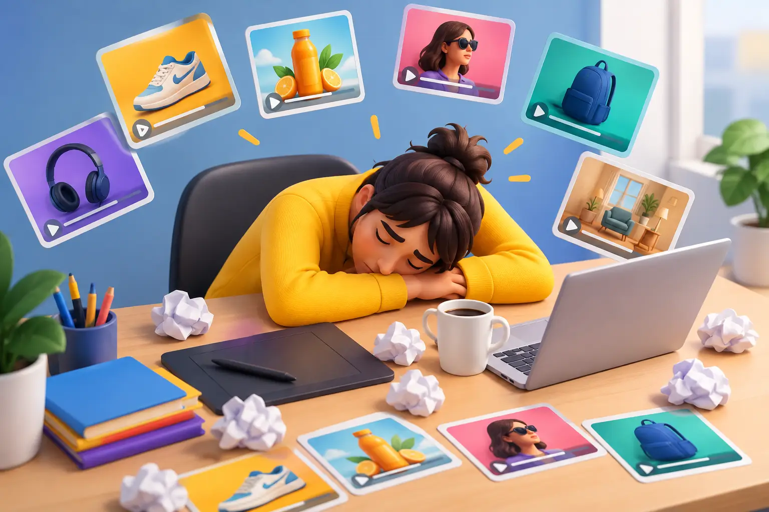
A puzzle swap, a quick win, a familiar end card, then the same puzzle swap in a different color. That is how creative fatigue quietly takes over a playable ad program. The team is still producing assets, campaigns are still spending, and the reporting dashboard is still full. But each new version teaches less than the last.
For mobile game UA, creative fatigue is not simply an audience getting bored with an ad. It is a production and testing problem: the team keeps changing surface details while repeating the same promise, interaction, pacing, and payoff. A new background is a variation. A new player motivation is a concept.
The fix is not asking designers to be more original on demand. It is building a testing system that creates meaningful differences quickly, preserves what works, and makes weak ideas cheap to discard.
What creative fatigue looks like in playable ads
Creative fatigue often appears before an obvious performance collapse. You may see click-through rate flatten across fresh exports, install quality become inconsistent, or a formerly reliable concept require increasingly aggressive visual changes to get attention. Sometimes the warning is operational: every brief starts with, “Make another version of the winner.”
That direction makes sense when a concept is still producing useful results. It becomes a problem when “another version” means changing the character skin, button color, or level art while leaving the actual user experience untouched.
In playable ads, the first few seconds carry disproportionate weight. If every ad opens with the same hand guiding the same merge move, players quickly recognize the pattern. Even a polished build can feel predictable if the hook, challenge, and reward are identical to the last five assets.
There is a second form of fatigue inside the team. Artists get stuck making exports rather than exploring ideas. UA managers cannot tell whether performance moved because of the opening, the mechanic, the audience, or the end card. Developers become a bottleneck for changes that should take minutes. This is where creative fatigue becomes expensive: not because one ad gets old, but because learning slows down.
Diagnose the problem before making more assets
Do not label every performance decline as fatigue. Network delivery, audience expansion, seasonality, bid changes, and product-level shifts can all affect results. The practical question is whether your recent tests contain enough meaningful creative distance to diagnose a trend.
Review the last 10 to 20 playable ads and tag each one by four elements: opening hook, core interaction, player fantasy, and conversion path. If most tags repeat, you are not running a broad test plan. You are running production variations.
For example, a match game could be framed as a rescue moment, a room makeover, a competitive score chase, or a satisfying chain reaction. Those are distinct fantasies, even if the underlying game logic shares assets. By contrast, changing a rescue character from a dog to a cat may matter visually, but it does not necessarily test a different reason to play.
Also examine where users stop engaging. If a playable ad gets clicks but poor interaction completion, the opening may overpromise relative to the mechanic. If players engage with the game but do not tap through, the end card may be disconnected from the experience. Treat these as separate creative questions. A single blended performance number can hide the source of fatigue.
Build a concept matrix, not a backlog of reskins
The fastest way to escape repetition is to define the few variables that can change the player’s experience. For a casual mobile game, that matrix might combine different hooks, mechanics, stakes, and payoffs.
A hook can start with a near-failure, an unusual transformation, a highly satisfying action, or a direct challenge. The mechanic can focus on sorting, aiming, upgrading, decorating, merging, or timing. Stakes can be personal progress, competition, rescue, collection, or mastery. The payoff can be a dramatic win, an upgrade reveal, a before-and-after transformation, or a promise of deeper progression in the full game.
You do not need to test every combination. Choose a small set that gives each concept a clear job. One playable might test whether a fail-state hook earns attention. Another might test whether players respond better to a clean skill challenge than a narrative setup. A third might test whether an upgrade payoff creates stronger intent after interaction.
This distinction protects the team from false learning. If one ad changes the intro, game mechanic, art style, and end card all at once, it may produce a winner, but you will not know why. Early concept testing should be opinionated but controlled: change one major strategic variable, then use smaller iterations to refine it.
Keep the first interaction honest
A common response to fatigue is adding more spectacle to the opening. That can work, but only if the interaction delivers on the setup. If the ad opens with a dramatic tower collapse and then asks users to perform a slow, unrelated tap sequence, the experience loses credibility.
The best playable ads make the promise and the first action feel connected. Show a blocked path, then let the user clear it. Show a weak character, then let the user choose an upgrade. Show a messy room, then let the user make the first satisfying improvement. The player should understand what to do without reading a tutorial paragraph.
Use a three-layer testing workflow
Creative teams need both variety and speed. A practical workflow separates concept exploration from production polish.
First, create rough prototypes. Use simple art, temporary copy, and the smallest playable loop that can answer the question. Can a timing challenge create more engagement than your usual merge interaction? Can a makeover reveal hold attention without a story setup? At this stage, do not spend days polishing particles and transitions.
Second, develop the strongest prototype into a small family of variations. Keep the central mechanic stable while testing the opening scene, difficulty curve, reward reveal, and call to action. This is where a team can learn whether a concept needs a faster first move or a clearer end-state rather than abandoning it too soon.
Third, localize and adapt proven structures for campaign needs. Adjust copy, visual references, orientation, and assets where appropriate, but avoid treating each adaptation as a brand-new test. Record what is inherited from the winning concept and what changed for the market or network.
A no-code production environment is useful here because it reduces the cost of the middle step. In PlayableMaker, teams can reuse scenes, game components, and assets while creating new playable ad directions without waiting for engineering support on every edit. That makes it more realistic to test a new hook or payoff, not just another art pass.
Refresh the mechanic without abandoning the game
Not every game has enough mechanics to support endless playable ad concepts. That is normal. The goal is not to pretend a merge game is an action shooter. The goal is to find the most compelling slice of the real product and present it through different moments of motivation.
For a builder game, one version can focus on the satisfying placement action. Another can start with a resource constraint and ask the player to make a smart choice. A third can emphasize the visual transformation after the build is complete. All three can use related assets and logic, but they give users a different reason to engage.
Difficulty is another underused lever. Some playable ads work best when the player wins immediately and receives a strong reward. Others benefit from a near-miss that creates a desire to try again or see the better outcome in the full game. Neither approach is universally better. A broad audience may need instant clarity, while a more skill-oriented game may benefit from a challenge that signals depth.
Avoid fake difficulty. If the ad forces failure regardless of the player’s action, users notice. A constrained but fair challenge is more useful because it reveals whether the core interaction itself is interesting.
Protect learning with better creative records
Creative fatigue gets worse when winning knowledge lives only in scattered chat threads or someone’s memory. Every playable ad should have a short record: its hypothesis, the major variables, its version history, and the result you observed. The record does not need to be elaborate. It needs to be consistent.
Use names that explain the test. “Merge_v12_final_final” tells nobody what changed. “Merge_RescueHook_FastReward” gives the next reviewer a usable starting point. Save reusable elements separately, especially tutorials, end cards, interaction patterns, sound cues, and validated technical settings.
Before export, preview the full flow on the intended device size and validate the HTML5 build for the ad environment. A fresh concept cannot teach you much if a tap target fails, an asset loads incorrectly, or the ad breaks after handoff. Technical reliability is part of creative velocity.
The next brief should not ask for more ads. It should ask a sharper question: what player motivation have we not tested yet? Build the smallest playable ad that can answer it, launch it cleanly, and let the result determine the next move.