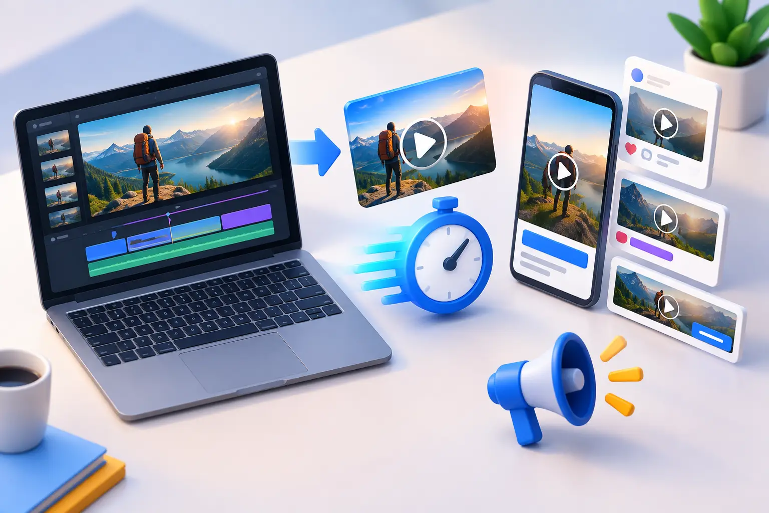
A high-performing game video already contains the raw material for a playable ad: a clear hook, a game moment, a visual payoff, and a reason to install. The challenge is that you cannot simply convert video to playable ads by placing an MP4 inside an ad unit. A playable needs real interaction, a fast first experience, and HTML5 behavior that works after the user taps.
The smartest approach is not to rebuild your full game. It is to identify the one decision or mechanic that made the video worth watching, then recreate that moment as a short, controlled interactive sequence. Done well, the playable feels like a natural continuation of the video creative, not a separate asset with unrelated gameplay.
Why video cannot become a playable ad automatically
Video is linear. The viewer watches the outcome the creative team has chosen. A playable ad is state-based: the user takes an action, the ad responds, and the experience moves forward based on that input.
That difference changes production. A video of a character dodging obstacles might look simple, but the playable version needs touch controls, collision logic, win and fail states, a restart behavior, sound handling if audio is used, and a clear end card. Even a fake interaction must react convincingly enough that the user understands what happened.
The goal is not a literal frame-by-frame conversion. Video is a reference for pacing, art direction, camera framing, and the player fantasy. The playable is a focused prototype of the most persuasive moment.
For user acquisition teams, this distinction matters because video and playable ads often serve different jobs. Video can establish the fantasy quickly. The playable can qualify interest by letting users try the core action. If the two creatives promise different experiences, the campaign may attract taps without building the right expectation.
Start with the right video moment
Before opening a builder or assigning a production brief, watch the source video with a more specific question: what should the user do in the first three seconds?
A good source clip has one obvious action. For a merge game, that could be dragging two matching objects together. For a runner, it could be swiping left to avoid a hazard. For a puzzle game, it could be pulling a pin or choosing the correct item. The strongest candidates communicate the action visually, even with audio off.
Avoid trying to turn a cinematic montage into a playable. A montage can be excellent video creative because it moves quickly through multiple rewards, characters, and environments. In a playable, too many mechanics create friction. You need one primary interaction and one clear reward.
A useful production rule is to separate the ad into three beats:
- The hook shows the problem, goal, or tempting reward.
- The interaction gives the user a simple action with an immediate response.
- The payoff confirms progress and leads naturally to the install prompt.
For example, a video may show a player rescuing a character from rising lava, then upgrading a base. The playable does not need both systems. Build the rescue interaction first. After the rescue, use the upgraded base as the payoff on the end card or final scene.
How to convert video to playable ads step by step
1. Break the video into reusable production assets
Treat the video as a source file, not a design specification. Pull out the elements that help recreate the playable: backgrounds, characters, props, UI panels, effects, font treatment, and end-card messaging.
Some elements can be extracted directly if the original layered assets are available. Others may need to be rebuilt as lightweight sprites or simplified shapes. This is often the right trade-off. A detailed scene rendered for video may be too heavy or too visually busy for a mobile HTML5 ad.
Keep only what supports the interaction. If an ornate background makes the gameplay area hard to read, simplify it. If a character has a complex animation, use a short idle loop and a distinct success pose rather than importing every movement from the video.
2. Recreate the mechanic, not the full game
The playable should communicate the game fantasy in one interaction. That may be a real mechanic with simplified rules, or a guided sequence that gives the user a satisfying first move. Which route is right depends on the campaign.
A real mini-game is useful when player skill or decision-making is central to the title. Think aiming, sorting, timing, merging, or route selection. The logic needs to be reliable, but it does not need every progression system, level variation, or economy feature from the app.
A guided interaction can work better when the game is visually complex or when the source video relies on a highly polished scripted moment. For instance, a user may be asked to drag a key to open a cell, with the scene responding in a controlled sequence. It still needs to feel responsive. A drag that ignores the user until a predetermined animation plays will feel fake immediately.
3. Design the first interaction for mobile thumbs
The first touch should be obvious and forgiving. Use a visible instruction such as “Drag to merge” or “Swipe to dodge,” but do not let text carry the entire explanation. The screen itself should show what can move, where it should go, and what success looks like.
Make touch targets larger than the visual object when possible. A small key, gem, or character can look correct at its intended size while having a more generous hit area. This is especially important when ads appear on smaller devices or when players are tapping quickly after watching a video preview.
Avoid lengthy tutorials. If a user has not interacted within a moment or two, a subtle motion cue can help: a pulsing destination, a brief ghost hand, or an idle animation on the draggable object. The cue should disappear once the user engages.
4. Build a clear success path and a useful failure path
Most playable ads should let users reach a positive outcome quickly. That does not mean every ad must be impossible to fail. A small challenge can make the interaction feel more credible, particularly for skill-based games.
The key is recovery. If a user misses a target or makes the wrong choice, show what happened and offer a fast retry. Do not trap them in a long fail animation. The goal is to maintain momentum toward the end card, not to simulate a full game session.
Use the result screen to reinforce the promise made by the video. A puzzle playable can reveal the satisfying solved scene. A strategy playable can show a stronger army. A makeover playable can reveal the final transformation. Then present a direct call to action that matches the app-store destination.
5. Test like an ad, not like a game build
A playable can look perfect in a desktop preview and still fail in an ad environment. Test the first load, orientation, touch behavior, sound defaults, restart flow, end-card timing, and click-through behavior. Review it on real phones, not only in a browser window.
Also test the creative premise. Build two versions when the source video contains more than one compelling moment. One version might focus on a rescue mechanic; another might focus on collecting rewards. Keeping the underlying scene structure and assets consistent makes the test cleaner and reduces production time.
This is where no-code production changes the workflow. In PlayableMaker, a creative team can turn a video reference into scenes, interactions, reusable asset sets, and export-ready playable variations without sending every small revision through engineering. Technical teams can still control logic where needed, while UA and creative teams gain room to test hooks, prompts, difficulty, and payoff scenes faster.
Keep the playable faithful to the ad promise
The most common creative mistake is using the video only as decoration. A polished trailer may show tower defense, while the playable becomes a generic match interaction because it is easier to build. That can create a disconnect between the click and the product the user expects.
Faithfulness does not require a full simulation. It means the interaction should represent the same emotional promise. If the video sells clever problem-solving, let the user solve something. If it sells speed and precision, make timing matter. If it sells collection and progression, let the user earn or combine something visible.
The exception is when a video concept has proven attention but its literal mechanic is impractical in an ad unit. In that case, preserve the fantasy rather than forcing a weak replica. A complex battle can become a simple squad-placement choice if the outcome still communicates strategy, scale, and reward.
Make every version easier to produce
The best video-to-playable workflow gets faster after the first build. Organize art by component, not by one-off campaign file. Keep characters, UI, particles, backgrounds, and common end-card elements reusable. Build interaction patterns that can be reskinned: drag-and-drop, tap-to-upgrade, swipe-to-avoid, choose-the-right-item, and simple timing challenges.
That structure gives a UA team more useful options. You can test a new visual hook without rebuilding the mechanic. You can use the same mechanic with a different level layout. You can adapt the end card for a seasonal event while keeping the core experience stable.
Start with the video that already earns attention, isolate its strongest player moment, and build the smallest playable that delivers on that promise. The first version does not need to represent everything in the game. It needs to give the right user one satisfying reason to tap, play, and keep going.