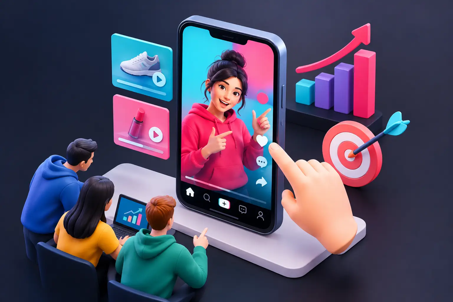
A TikTok interactive ad format has one job that a standard video ad cannot do on its own: turn passive attention into a small, deliberate action. For mobile game UA teams, that action can reveal whether someone is drawn to your core loop, your progression fantasy, or simply the satisfaction of a well-timed tap.
That does not mean every interactive concept belongs on TikTok. The feed is fast, sound-on, creator-led, and unforgiving of slow starts. The strongest executions use interaction to extend a clear video idea, not to bury the audience in a miniature game before they understand why they should care.
What the TikTok Interactive Ad Format Means
The phrase can describe two related but distinct approaches. First, TikTok offers interactive enhancements that sit on or around an in-feed video experience, such as elements that invite users to tap, swipe, vote, or otherwise engage. These are designed to make a video unit more participatory without asking the user to enter a full HTML5 experience.
Second, UA teams often use “interactive ad” more broadly to mean a playable ad: a lightweight HTML5 unit where the user tries a simplified version of the game before reaching a call to action. The production approach, asset constraints, and measurement questions are different.
Treat these as different creative products. An interactive overlay is usually best when the video already communicates the hook and the interaction adds a quick payoff. A playable ad is better when the game’s appeal depends on agency: aiming a shot, sorting objects, choosing an upgrade, dragging a character, or solving a short puzzle.
Before production, confirm the current placements, specifications, and approval rules available in your TikTok account and target markets. Platform support changes, and a technically valid HTML5 build for one network is not automatically ready for another.
Why TikTok Changes the Creative Brief
Most users encounter your ad between creator videos, not while actively looking for a game to install. You have very little time to establish a recognizable premise. A playable that begins with a loading screen, a logo, or a detailed tutorial is already losing the argument.
Start with a single visual promise. For a merge game, show the crowded board and the satisfying combination before asking for a tap. For a shooter, show a dangerous target and a high-impact weapon. For an idle tycoon title, show a cramped operation becoming a polished business. The interaction should let the player participate in that promise within seconds.
The common mistake is adapting a store build too literally. A production game may need menus, currencies, multiple systems, and a gradual difficulty curve. An ad needs one readable decision and a rewarding outcome. It is a creative demonstration, not a vertical slice.
TikTok also rewards visual clarity. Small UI labels, muted color contrast, and intricate scenes may be understandable to the development team because they know the game. They are much harder to parse while someone scrolls on a phone. Use a large focal object, clear touch targets, and motion that explains the desired action.
Choose the Interaction That Proves the Hook
A good mechanic does more than keep a finger busy. It gives the user a reason to believe the installed game will be satisfying. That is why mechanic selection should follow the game’s marketable fantasy, not whatever interaction is easiest to build.
For a match or merge title, a short drag-and-combine sequence can communicate the loop quickly. For a strategy game, choose one tactical decision, such as selecting the right unit to counter an enemy lane. For a makeover or simulation game, a before-and-after choice can work well if the transformation is immediate and visually strong.
There is a trade-off between fidelity and speed. A highly faithful playable may appeal to qualified users, but it can be expensive to produce and difficult to iterate. A simplified “fail versus fix” scenario may generate a cleaner first test, but it can attract users who do not actually want the full game. The right answer depends on what your campaign needs to learn.
When the goal is broad hook testing, reduce the experience to the clearest fantasy. When the goal is improving install quality, bring the interaction closer to the game’s real loop. Do not assume the same creative should do both jobs.
A Practical Production Workflow
The fastest teams avoid treating every new concept as a custom engineering project. They build a repeatable production path that starts with a testable hypothesis and ends with a network-ready export.
First, write the concept in one sentence: “Players will respond to rescuing a failing bakery by making one fast upgrade choice.” If the premise cannot be stated that simply, the first version is probably trying to do too much.
Next, map the experience in five beats: hook, instruction, first action, payoff, and call to action. The instruction should often be visual rather than textual. An animated hand, a pulsing button, or an object moving briefly toward its destination can communicate the action without stopping the pace.
Then build only the assets needed for those beats. This is where teams often overspend. You do not need every character pose, every environment, or a complete interface. You need the moments that make the interaction believable: the problem state, the player action, the rewarding state, and the final brand or gameplay frame.
Preview on a real mobile device early. A drag action that feels obvious with a mouse can feel awkward with a thumb. Check whether buttons sit too close to the screen edge, whether the first animation obscures the action, and whether the CTA appears after the payoff rather than competing with it.
Finally, validate the build before trafficking. File size, loading behavior, touch handling, orientation, click-through behavior, and packaging requirements can turn a promising concept into a rejected or broken placement. MRAID validation is especially useful when preparing HTML5 playable ads for environments that require it.
A no-code builder such as PlayableMaker can shorten this cycle by letting creative and UA teams turn existing video, art, and reusable game components into variations without assigning a developer to every copy, timing, or logic adjustment. The benefit is not merely speed. It is the ability to test more informed creative choices while the campaign insight is still useful.
Build Variations Around One Question
Do not create five versions that all change the headline, background, mechanic, and CTA at once. If performance changes, you will not know why.
A better TikTok testing plan isolates one variable at a time. You might test whether a “save the character” opening earns more interaction than a “build the base” opening, while keeping the same playable sequence and end card. Once you identify the stronger premise, test the interaction itself: tap versus drag, one choice versus two, instant reward versus a short progress bar.
The useful signals depend on the unit and campaign setup, but the interpretation is consistent. If users reach the experience but do not interact, the prompt may be unclear or the action may arrive too late. If they interact but do not continue to the store, the payoff or CTA may be weak. If click-through looks strong but downstream quality falls, the ad may be selling a fantasy the product does not deliver.
This is also where misleading playable design creates expensive problems. A fake puzzle that bears no relationship to the game can produce curiosity, but it creates a mismatch after install. Better creative distills a real emotional or mechanical truth about the game, even when the ad uses a simplified scenario.
Technical Decisions That Protect the Experience
Keep the first interactive moment lightweight. Large image sequences, unnecessary sound files, and excessive animation can slow the initial experience. Compress assets carefully, reuse sprites where possible, and prioritize the visual elements that appear before and during the first action.
Design for interruption. People may tap quickly, pause, lose focus, or move directly toward the CTA. Your playable should not rely on an exact sequence of perfect inputs. Give the interaction forgiving hit areas, prevent dead-end states, and ensure that a user can still reach a clear end state after an imperfect action.
Use sound as an enhancement, not a requirement. TikTok is often sound-on, but users may still have volume disabled. A reward should read visually through motion, color, particles, a status change, or a clear transformation.
The best next move is simple: take one proven video hook from your current TikTok creative, identify the one action that makes its promise real, and build a short interactive version around that moment. That is a much stronger starting point than trying to squeeze an entire game into an ad.